Recroatia Website


Project Details
The goal of the project was to create a website for Recroatia’s services. Recroatia is a platform that offers health and fitness programs and the client wanted a website that showcases their work as a recreation platform.
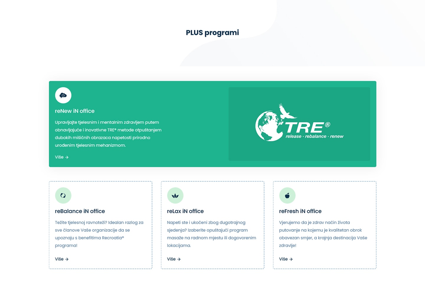
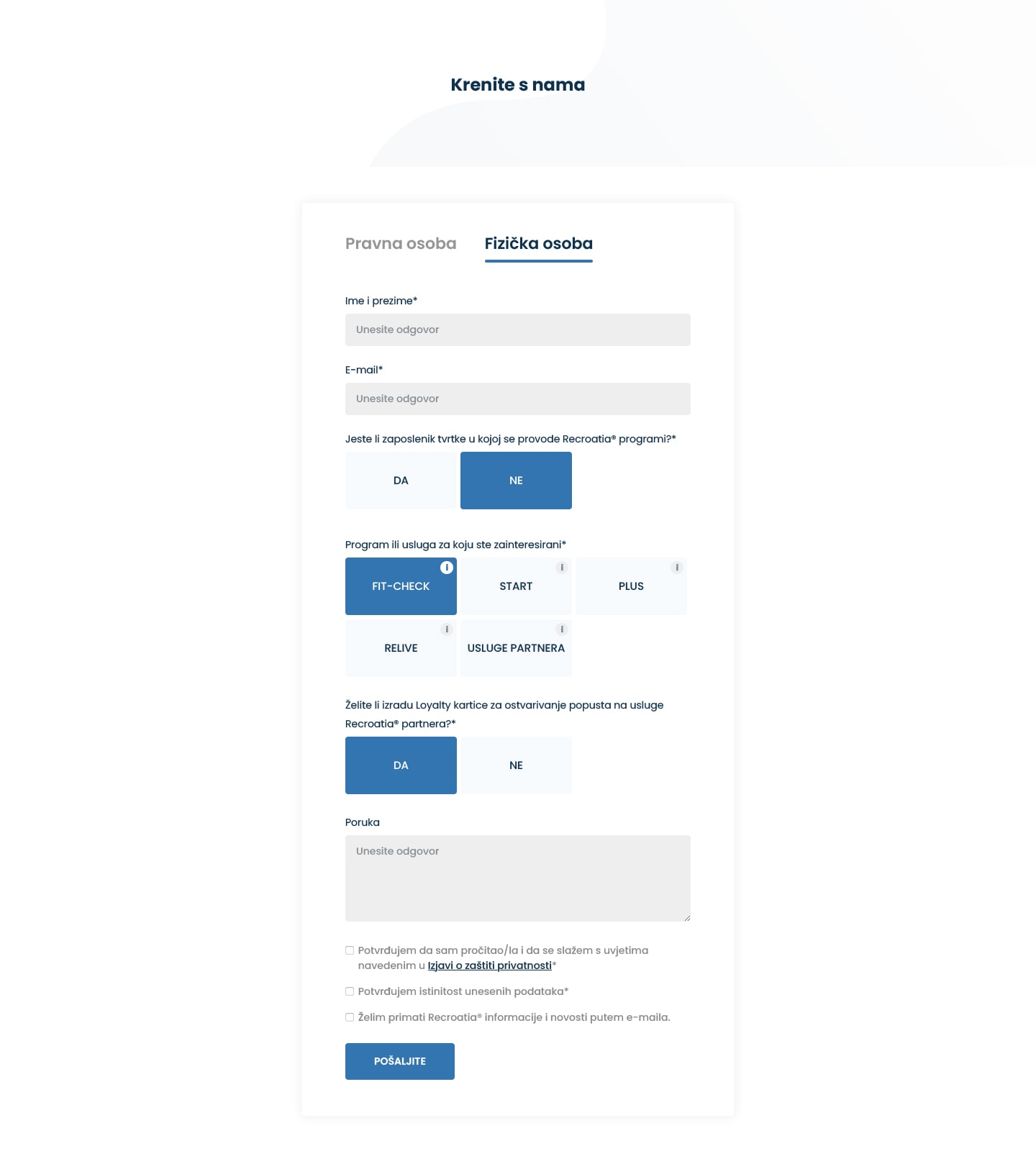
With the design I used the blue color throughout the project as the primary and sometimes only color on the page. Blue was a perfect choice for this websites as it best helped emphasize a calming and soothing atmosphere. We symbolize blue with oceans, sky and nature, and Recroatia offers most of their services in an outdoor environment, so it made a perfect association. Different shades were used alongside light typography, rounded edges and easing animations on websites elements to produce the feeling of softness and lightness, to inspire people to get refreshed and get an exercise. Recroatia made a video that was used as the background above the fold to immediately give people the idea of what their service is like.
With these goals and motives set, this is the final design of the landing page.
